

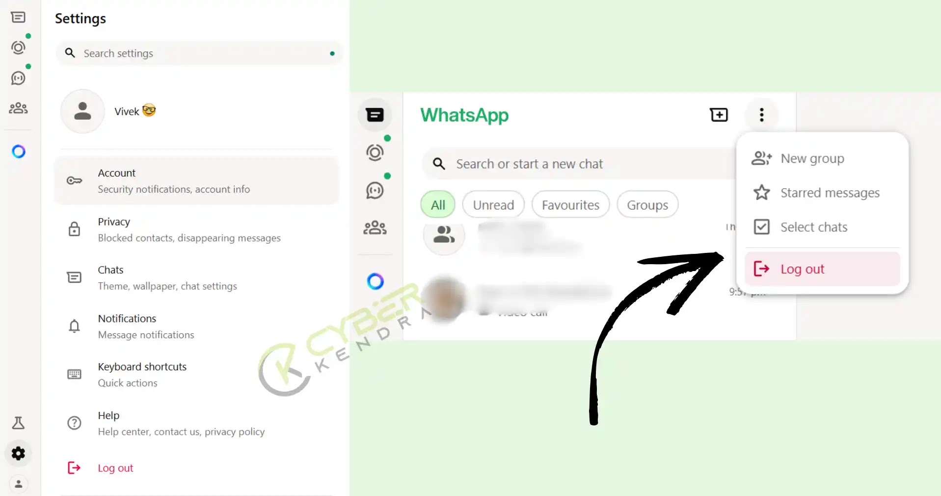
Today, WhatsApp Web has undergone a significant redesign, giving it a new look. The latest WhatsApp Web interface features a cleaner, more modern design with a consistent color scheme dominated by WhatsApp’s signature green and white.
The layout is organized into a two-panel structure like earlier, with navigation on the left and a conversation/content area on the right, but it gets a fresh color scheme and clean UI interface.
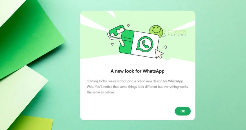
When we first checked the new WhatsApp web look, we saw a notification informing users about the redesigned interface.
The popup states: “A new look for WhatsApp” and a message that reads, “Starting today, we’re introducing a brand new design for WhatsApp Web. You’ll notice that some things look different but everything works the same as before.”
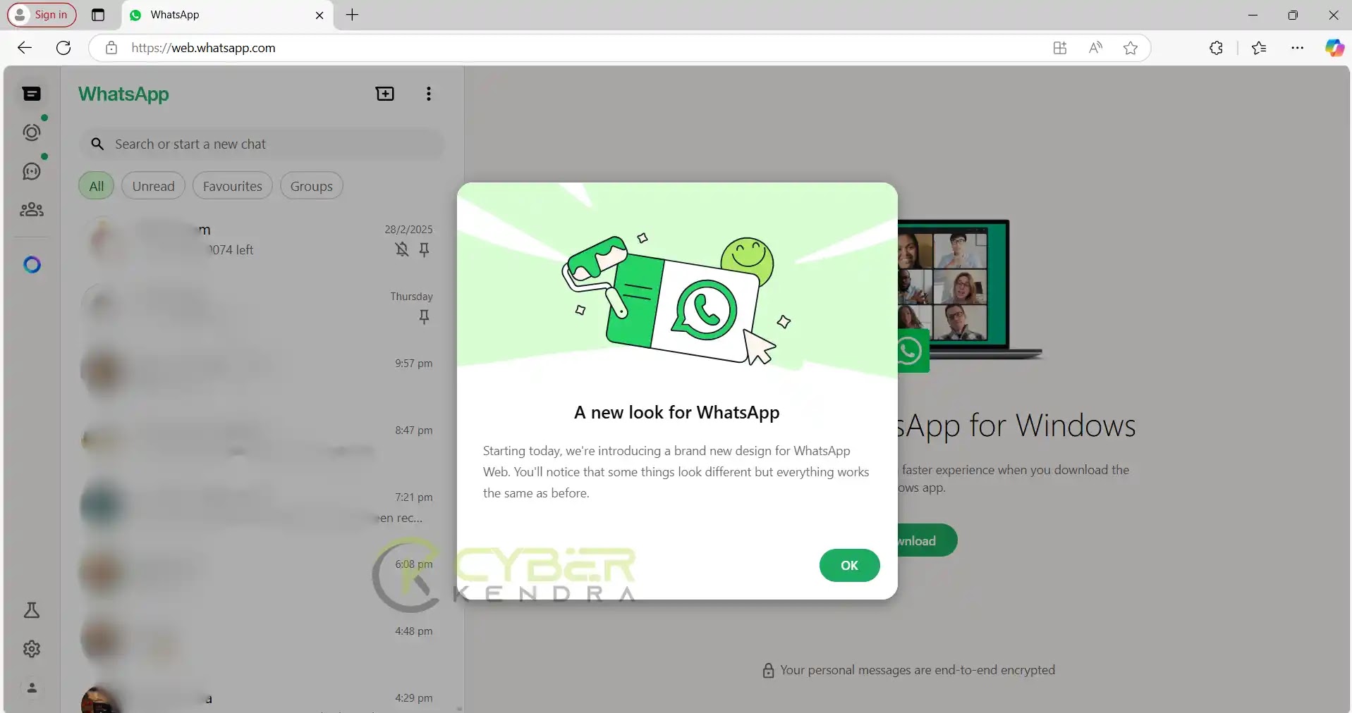 |
| New UI with Welcome Note |
 |
| Fresh look with the color scheme |
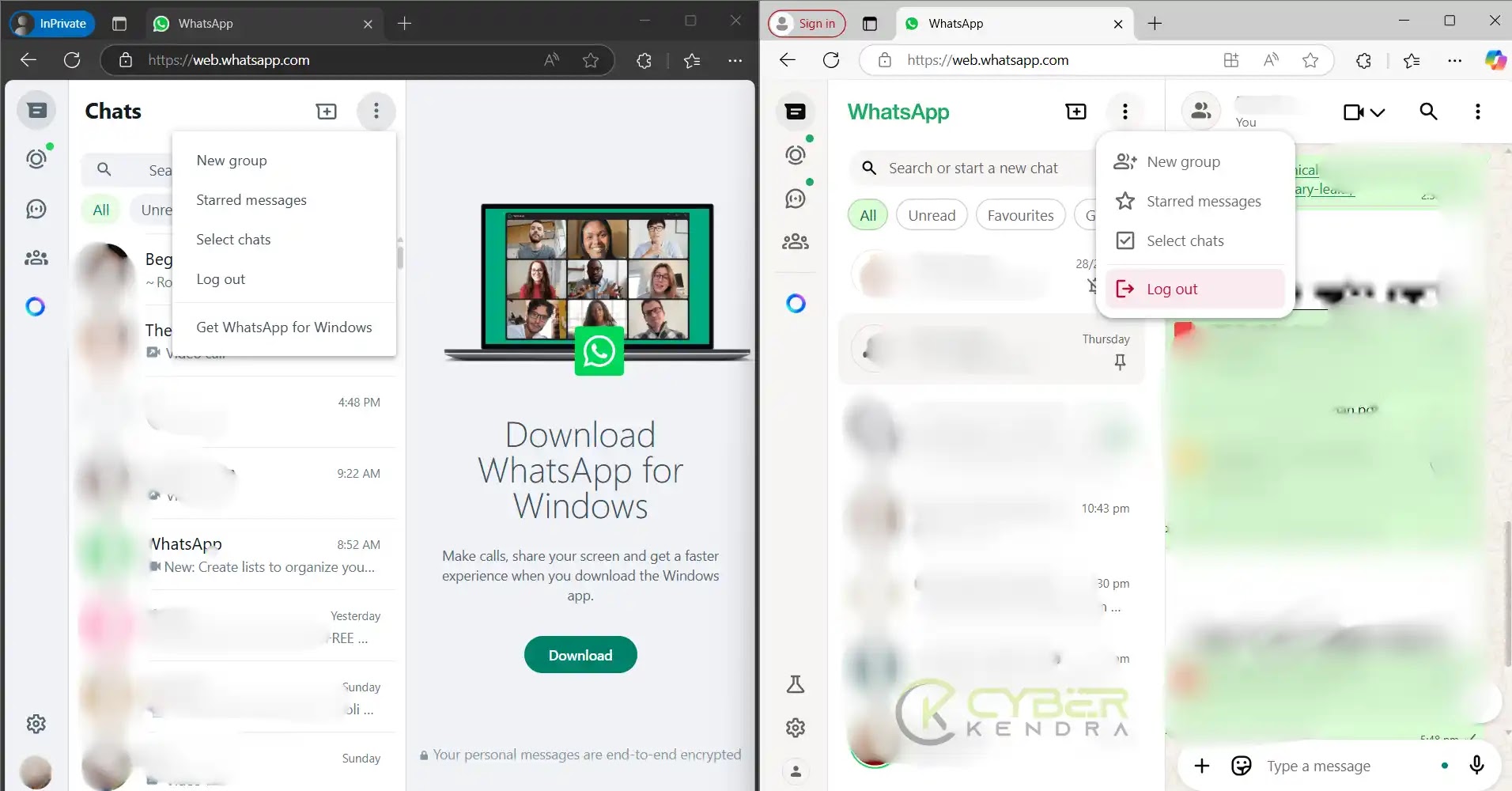 |
| Compare Old vs New UI look |
This new look is available on WhatsApp web version 2.3000.1020782533 (beta).
The overall redesign maintains WhatsApp’s core functionality while presenting a more streamlined, contemporary aesthetic with improved organization of features and settings.
What do you guys think of this new modern and clean UI of WhatsApp web? Comment your opinion below.😊


Community Discussion
Join the conversation. Ask questions, share solutions, and help others.
Be the first to start the discussion!